Andrea's A2 Media Blog
Wednesday, 2 May 2018
Tuesday, 1 May 2018
Evaluation Questions 1-4
Question One:
In what ways does your media product use, develop or challenge forms and conventions of real media products?
I have made a presentation answering this question using Prezi.com but I have also made a narrated version of this also which can be seen below:
Prezi:
Narrated Prezi:
I have made a presentation answering this question using Prezi.com but I have also made a narrated version of this also which can be seen below:
Prezi:
Narrated Prezi:
Question Two:
How effective is the combination of your main product and ancillary texts?
I have made a presentation answering this question using Emaze.com, and a narrated version of the same presentation, which can be seen below:
I have made a presentation answering this question using Emaze.com, and a narrated version of the same presentation, which can be seen below:

Narrated:
Question Three:
What have you learned from your audience feedback?
I have made a presentation answering this question using Visme.com which can be seen below:
I have made a presentation answering this question using Visme.com which can be seen below:
Question Four:
How did you use media technologies in the construction and research, planning and evaluation stages?
I have made a presentation answering this question using Prezi.com which can be seen below:
I have made a presentation answering this question using Prezi.com which can be seen below:
Monday, 30 April 2018
Making the Poster and Changing the Title Font
30th April 2018
Today, Eimir and I began editing the poster and we were looking for some fonts that resembled a ransom note, such as magazine cut outs of letters which we found many samples of on 1001fonts.com. We found around 5 that we really liked and screenshotted each of these to compare which one looked the best, and we finally settled on a font called 'Got Heroin'.
Some of our options are inserted below:


We decided to invert the colours of the font as it was originally white text on black cut outs, and we wanted it to be the opposite way around, so we inverted the colours of the text using a website called PineTools.com. Once we had placed this font on our poster and decided that it looked really good, we realised that we needed it to relate to a font in the film in order to keep continuity - so, we changed the font from the final title screen to this same font and text. This allowed us to keep a link from the film text to the poster text, and also get to keep the creepy, crime-like font that we thought fitted the best.
Before we did any of this, we edited the colours such as the saturation, brightness, structure and warmth of the photo that we took for the poster on an app called Facetune, which Eimir was able to do using her iPhone, making it really easy for us to edit the photo quickly and in a way that was easily changeable if we wanted to change anything.
In the making of the poster, Eimir and I reflected back onto our poster analysis which we had completed a while ago in order to collect information about the codes and conventions of typical mockumentary film posters. I came up with the idea to put a bloody slab of meat on a plate which would represent the dinner scene in our film, which eventually evolved into putting a heart on a plate. We were able to do this as I organised with the Biology department in school to allow our group to use a heart, and my dad also went to the butchers and got some liver with lots of excess blood, so that we could use the blood in the photo, but also that in case the heart looked bad/didn't work, we had backup bits of meat to use. We had taken the picture of the heart on the plate in this way because typically, in mockumentary posters either the main character or an object to do with the main theme of the film is placed in the centre of the poster - which is why we placed a raw heart with blood surrounding it on a dinner plate, to reflect how our film surrounds love/dating which is shown by the heart, but the fact that it is raw and is surrounded by a pool of blood suggests that murder will occur in this film. We kept the colour scheme of the poster pretty dark and eery to stick to the red/black colour scheme that we had typically used throughout our entire film planning process - eg with the costumes.
Once we had figured out the main layout of the poster, had edited the picture and added the title, it was time to add the smaller parts, such as the cast names and the crew credits. We added the main cast names above the title at the top of the poster in a font called Copperplate, which is a block capitals font which looks almost like font on a gravestone. We put the cast names here because this is typically where we have seen them on posters, and figured that this would make the poster look more professional and similar to a real poster, as well as drawing attention to the names of the cast. We separated the names of Cormac and Beth with a white heart in the middle, to again reflect the love aspect of the film. We then added the crew credits to the bottom third of the poster, just below the image of the plate, which we also added in the font Copperplate. We took an example poster and basically reworded their crew credits so that we would know what to include and what not to include, to make it look as realistic and professional as possible. We even made the names of the crew and important words taller in size than the actual roles of the crew, to make the names stand out more to the audience. This was also a pretty common theme in many posters that we looked at, so we decided to stick with that.
Lastly, we added the release date and social media links to the very bottom of the poster in the same font as before, including a twitter logo to initiate to the audience that the film is available for following on social media to increase promotion. This allows the audience to become excited/spread awareness of the release of the film, especially through the use of social medias.
Today, Eimir and I began editing the poster and we were looking for some fonts that resembled a ransom note, such as magazine cut outs of letters which we found many samples of on 1001fonts.com. We found around 5 that we really liked and screenshotted each of these to compare which one looked the best, and we finally settled on a font called 'Got Heroin'.
Some of our options are inserted below:


We decided to invert the colours of the font as it was originally white text on black cut outs, and we wanted it to be the opposite way around, so we inverted the colours of the text using a website called PineTools.com. Once we had placed this font on our poster and decided that it looked really good, we realised that we needed it to relate to a font in the film in order to keep continuity - so, we changed the font from the final title screen to this same font and text. This allowed us to keep a link from the film text to the poster text, and also get to keep the creepy, crime-like font that we thought fitted the best.
Before we did any of this, we edited the colours such as the saturation, brightness, structure and warmth of the photo that we took for the poster on an app called Facetune, which Eimir was able to do using her iPhone, making it really easy for us to edit the photo quickly and in a way that was easily changeable if we wanted to change anything.
In the making of the poster, Eimir and I reflected back onto our poster analysis which we had completed a while ago in order to collect information about the codes and conventions of typical mockumentary film posters. I came up with the idea to put a bloody slab of meat on a plate which would represent the dinner scene in our film, which eventually evolved into putting a heart on a plate. We were able to do this as I organised with the Biology department in school to allow our group to use a heart, and my dad also went to the butchers and got some liver with lots of excess blood, so that we could use the blood in the photo, but also that in case the heart looked bad/didn't work, we had backup bits of meat to use. We had taken the picture of the heart on the plate in this way because typically, in mockumentary posters either the main character or an object to do with the main theme of the film is placed in the centre of the poster - which is why we placed a raw heart with blood surrounding it on a dinner plate, to reflect how our film surrounds love/dating which is shown by the heart, but the fact that it is raw and is surrounded by a pool of blood suggests that murder will occur in this film. We kept the colour scheme of the poster pretty dark and eery to stick to the red/black colour scheme that we had typically used throughout our entire film planning process - eg with the costumes.
Once we had figured out the main layout of the poster, had edited the picture and added the title, it was time to add the smaller parts, such as the cast names and the crew credits. We added the main cast names above the title at the top of the poster in a font called Copperplate, which is a block capitals font which looks almost like font on a gravestone. We put the cast names here because this is typically where we have seen them on posters, and figured that this would make the poster look more professional and similar to a real poster, as well as drawing attention to the names of the cast. We separated the names of Cormac and Beth with a white heart in the middle, to again reflect the love aspect of the film. We then added the crew credits to the bottom third of the poster, just below the image of the plate, which we also added in the font Copperplate. We took an example poster and basically reworded their crew credits so that we would know what to include and what not to include, to make it look as realistic and professional as possible. We even made the names of the crew and important words taller in size than the actual roles of the crew, to make the names stand out more to the audience. This was also a pretty common theme in many posters that we looked at, so we decided to stick with that.
Lastly, we added the release date and social media links to the very bottom of the poster in the same font as before, including a twitter logo to initiate to the audience that the film is available for following on social media to increase promotion. This allows the audience to become excited/spread awareness of the release of the film, especially through the use of social medias.
Thursday, 26 April 2018
Adding Production Company
26th April 2018
In order to make our film look more professional, we added a distribution company ident into our film at the beginning. Instead of using a popular ident such as Film4, we decided to search for an ident from a company that would be more likely to distribute a short film like ours. For this reason, we chose the ident from a distribution company called ShortsTV.

ShortsTV are a distribution company which distribute high quality short films. They are a 24/7 HD TV channel dedicated to short films. We inserted this into the first frame of our film because that is typically where the production company is shown in films.
After this, we also added our own distribution company called 'EMA Productions' which we made up last year for our other film, The Secret. We inserted this ident that we designed after the second frame in the film.

This just shows that we had put thought into the distributive process that would occur for our film, and it also allowed us to make our film look much more professional.
In order to make our film look more professional, we added a distribution company ident into our film at the beginning. Instead of using a popular ident such as Film4, we decided to search for an ident from a company that would be more likely to distribute a short film like ours. For this reason, we chose the ident from a distribution company called ShortsTV.

ShortsTV are a distribution company which distribute high quality short films. They are a 24/7 HD TV channel dedicated to short films. We inserted this into the first frame of our film because that is typically where the production company is shown in films.
After this, we also added our own distribution company called 'EMA Productions' which we made up last year for our other film, The Secret. We inserted this ident that we designed after the second frame in the film.

This just shows that we had put thought into the distributive process that would occur for our film, and it also allowed us to make our film look much more professional.
Monday, 23 April 2018
Adding Alarm Sound
23rd April 2018
Today, I went through the dinner scene and had to add the alarm effect that would've been coming from the kitchen during the date. This is the alarm that stops Bobby mid sentence and breaks up the dinner scene. I went to the sound effects tab and searched through all of the alarm sounds, listening to small snippets of many alarm sounds, but Maeve and I finally settled on a sound effect called "Alarm Clock Bell" which sounds like a timer on an oven, which is what we were going for.
The sound effect was added just at the beginning of Bobby's sentence, so it interrupts his speech. I faded out the effect towards the end so it doesn't sound so abrupt, and set the level of sound to -20.0db.

Fixing Audio
23rd April 2018
Today, we were playing through the film to check for any errors we hadn't yet dealt with, and found some areas where the audio needed fixed as it was either too quiet, or we had better audio recorded on a microphone which was much clearer. This was the case in some of the outdoor park scenes, such as the introduction scene where Poppy speaks about her struggle with finding love. The sound here sounded very quiet and was almost inaudible, but luckily we had recorded this scene on the field recorder too.
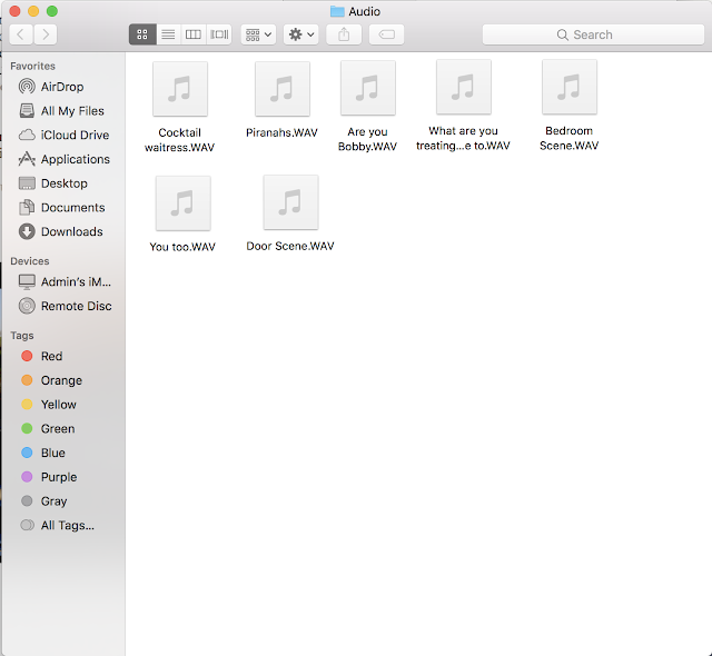
I detached the audio from the original clip and removed it from the film, and then added the field recorder audio which I had saved in a file called 'Audio' so it was easy to locate.

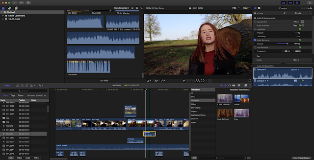
I had to adjust the audio a few times by cutting it short at the beginning, and moving it to fit the filmed clip perfectly. Once the audio fitted perfectly against the filmed clip, I noticed that the sound of wind was obvious towards the end of her speech, so to remove this sound as much as possible, I used the blade tool to split the audio into two parts from where the windy sounds began, and used audio effects on the audio affected by wind. I set the Equalisation to 'Flat' and checked the Audio Analysis which passed with no problems. So, I clicked to see more on the audio analysis, and from here I was able to adjust the effects myself, so I set Noise Removal to 100%. This helped to edit the sounds of wind out as much as possible, so it's quite subtle now. The subtle wind sound actually sounds natural though, as the clip was filmed outside, so this adds to the film.

Today, we were playing through the film to check for any errors we hadn't yet dealt with, and found some areas where the audio needed fixed as it was either too quiet, or we had better audio recorded on a microphone which was much clearer. This was the case in some of the outdoor park scenes, such as the introduction scene where Poppy speaks about her struggle with finding love. The sound here sounded very quiet and was almost inaudible, but luckily we had recorded this scene on the field recorder too.
I detached the audio from the original clip and removed it from the film, and then added the field recorder audio which I had saved in a file called 'Audio' so it was easy to locate.

I had to adjust the audio a few times by cutting it short at the beginning, and moving it to fit the filmed clip perfectly. Once the audio fitted perfectly against the filmed clip, I noticed that the sound of wind was obvious towards the end of her speech, so to remove this sound as much as possible, I used the blade tool to split the audio into two parts from where the windy sounds began, and used audio effects on the audio affected by wind. I set the Equalisation to 'Flat' and checked the Audio Analysis which passed with no problems. So, I clicked to see more on the audio analysis, and from here I was able to adjust the effects myself, so I set Noise Removal to 100%. This helped to edit the sounds of wind out as much as possible, so it's quite subtle now. The subtle wind sound actually sounds natural though, as the clip was filmed outside, so this adds to the film.

Subscribe to:
Comments (Atom)

