Wednesday 18th April
Today, we created the credits for the film. Instead of placing opening credits like we did in our film last year, we decided to place rolling credits on the final shot of the poison bottle. We placed the rolling credits on the side of the shot which looks very dark, almost black, and coloured the credits in white and the font as Times New Roman, which stood out exceedingly well against the dark area of the shot. We decided on rolling credits as we felt that they look very simple and plain, which is what we wanted for the ending of the film because the ending has so much going on in it.
In the credits, we named the actors/actresses we had and their roles in order of importance in the film. We then placed our own names and our generic roles in the production of the film, including production, editing, directing and casting. We also credited ourselves for coming up with the plot idea, and credited Eimir for mainly scripting the film.
Once the final shot fades out, it fades to an ending title screen which displays text saying "Last Dates" once again, but this time, the text is a shade of red and in the font Sketch Block and the text appeared by itself on a black background this time. This text is in the size 168.0
Wednesday, 18 April 2018

Tuesday, 17 April 2018
Making the Title Screen
Tuesday 17th April
Today, we created the title screen for our film. Firstly, we brainstormed ideas of what we wanted the title screen to include. This was easy enough as we all seemed to be on the same page due to the fact that we were focusing on a title screen for a dating show, so we already had pre-conceived ideas of what these title screens should look like from watching shows such as First Dates or The Undateables. We wanted to make a title screen really similar to these, pretty simple but effective - usually animated.
We noticed that Final Cut Pro didn't offer us the animated widgets that we wanted to use in our title screen, so we went searching for some animations that we could download for free. We came across a website called Stupid Raisins, which allowed you to download packs of animations for Final Cut Pro. We downloaded a pack called Sign Pop & Template Pop which contained a number of random widgets, but most importantly, it included a widget which looks like a folder which a heart on it - which perfectly fit our film. We decided to add this to a title screen with a white background. The title screen we chose had a black box image placed on it which we couldn't delete, so we placed the animated image on top of that. We also changed the text to say "Last Dates" and changed the font to Al Bayan and the size to 72.0. We also altered the colour of the font to a pink/peach shade, and changed the colour of the animated folder to be the same colour as the font, making it look more professional and nice to look at.
We then added some effects to make it a little more interesting, so we added the effect Bokeh Random which allowed the title screen to look as if it had some flashing lights flowing across it, but you could only see this effect on the text because the background was white, which left a nice effect. The animation also flew in on the title screen and flies out of the title screen, going to a black screen then transitioning to the next scene as the music ends.
We're really happy with our title screen, and think it looks really professional, and as if it was made for a real dating show.

Today, we created the title screen for our film. Firstly, we brainstormed ideas of what we wanted the title screen to include. This was easy enough as we all seemed to be on the same page due to the fact that we were focusing on a title screen for a dating show, so we already had pre-conceived ideas of what these title screens should look like from watching shows such as First Dates or The Undateables. We wanted to make a title screen really similar to these, pretty simple but effective - usually animated.
We noticed that Final Cut Pro didn't offer us the animated widgets that we wanted to use in our title screen, so we went searching for some animations that we could download for free. We came across a website called Stupid Raisins, which allowed you to download packs of animations for Final Cut Pro. We downloaded a pack called Sign Pop & Template Pop which contained a number of random widgets, but most importantly, it included a widget which looks like a folder which a heart on it - which perfectly fit our film. We decided to add this to a title screen with a white background. The title screen we chose had a black box image placed on it which we couldn't delete, so we placed the animated image on top of that. We also changed the text to say "Last Dates" and changed the font to Al Bayan and the size to 72.0. We also altered the colour of the font to a pink/peach shade, and changed the colour of the animated folder to be the same colour as the font, making it look more professional and nice to look at.
We then added some effects to make it a little more interesting, so we added the effect Bokeh Random which allowed the title screen to look as if it had some flashing lights flowing across it, but you could only see this effect on the text because the background was white, which left a nice effect. The animation also flew in on the title screen and flies out of the title screen, going to a black screen then transitioning to the next scene as the music ends.
We're really happy with our title screen, and think it looks really professional, and as if it was made for a real dating show.

Friday, 13 April 2018
Choosing Music
13th April 2018
Today we were researching music for the beginning and end of our film. We needed some light hearted and upbeat music generally consisting of instruments like a piano rather than acoustic guitar. We decided to search for this sort of music because it is very common in dating shows and documentaries, so we figured that it would perfectly fit our film as it is a mockumentary mimicking a dating show.
We searched for snippets of this sort of music on a few websites that supplied royalty free music, as we're not able to use music that is copyrighted which made it much more difficult to search for music that will fit.
The websites we have used to search for music so far have been:
- http://www.purple-planet.com/
- https://www.bensound.com/royalty-free-music/cinematic
- https://www.hooksounds.com/
After searching through multiple categories of music types such as calm, upbeat, jazz etc. and listening to roughly over 60 snippets, we decided on a track called 'Winter Wonder' from Purple Planet.
As for the music at the end of the film during the choking scene and the credits rolling, we have not yet found something that is royalty free and fits the scene how we want it to. Ideally, we're looking for something similar to Patsy Cline's "She's Got You", however it is very difficult to find a track like it with lyrics without it being copyrighted.
Tuesday, 10 April 2018
Changing the Brightness on shots
10th April 2018
Today, I focused on editing the brightness and saturation of some of the shots in our film to make the shots match better with the shots on either side of them, and match the theme of the film better. This also allowed me to make shots more clear and easier on the eye of the audience.
Below are a number of shots which I have edited the brightness/saturation of:
This shot needed lots of work to it because the lighting is so dark in the shot and also has a very warm hue, which we didn't really want because the shots on either side of it were more cool toned and lit very brightly. To alter this, I played around with the highlights and midtones to make it a little bit brighter, and I altered the saturation to make it a little less warm toned. All of the details are included in the screenshots:
BEFORE:

AFTER:


Below are a number of other shots which I have adjusted the brightness and saturation of, and the details of the brightness/saturation changes are included in the screenshots:


Today, I focused on editing the brightness and saturation of some of the shots in our film to make the shots match better with the shots on either side of them, and match the theme of the film better. This also allowed me to make shots more clear and easier on the eye of the audience.
Below are a number of shots which I have edited the brightness/saturation of:
This shot needed lots of work to it because the lighting is so dark in the shot and also has a very warm hue, which we didn't really want because the shots on either side of it were more cool toned and lit very brightly. To alter this, I played around with the highlights and midtones to make it a little bit brighter, and I altered the saturation to make it a little less warm toned. All of the details are included in the screenshots:
BEFORE:

AFTER:


Below are a number of other shots which I have adjusted the brightness and saturation of, and the details of the brightness/saturation changes are included in the screenshots:


Friday, 6 April 2018
Editing
Directly after filming was finished, we began editing the film. Even though we identified the faults in the footage from the first filming day and needed to refilm, we edited as much as we possibly could from the good footage. We firstly sorted through all of the footage and deleted all of the footage we definitely weren't using to ensure that we didn't get mixed up with shots. We then sorted through the script and shot list to see the order in which we would place our shots. This was fairly easy as we initially followed the planned shot list and then decided to play about with the order of some shots to see what parts fitted better and what transitioned well into each other.
Initially, we just wanted to get a grips of the general plan of the film, and get all of the shots into order and then we could deal with sound and brightness at a later stage. Once we had a general layout to the film, we started playing about with the audio of the shots and moving it around so that we could allow shots change whilst the audio still played.
Once we had also gotten the footage from refilming, this was all much easier because we could complete our storyline and begin focusing on how to make the editing better. At the moment, we're currently trying to adjust the audios and adjust the brightness of the shots to make sure that the shots are flowing well and look good together.
Initially, we just wanted to get a grips of the general plan of the film, and get all of the shots into order and then we could deal with sound and brightness at a later stage. Once we had a general layout to the film, we started playing about with the audio of the shots and moving it around so that we could allow shots change whilst the audio still played.
Once we had also gotten the footage from refilming, this was all much easier because we could complete our storyline and begin focusing on how to make the editing better. At the moment, we're currently trying to adjust the audios and adjust the brightness of the shots to make sure that the shots are flowing well and look good together.
Tuesday, 3 April 2018
Poster Research
In order to know what sort of poster to create for our film, I decided to do a little bit of research into what mockumentary/comedy posters look like so I could gain a general idea of the typical codes and conventions of the posters made.
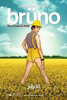


I then went on to analyse the poster for Borat, and applied the logic I gained from that to the other posters that I viewed, and I noticed that typically, the main characters of the film are placed in the centre of the poster, the reviews are at the top and bottom of the poster, and the font typically reflects the theme of the film.
I then went on to analyse the poster for Borat, and applied the logic I gained from that to the other posters that I viewed, and I noticed that typically, the main characters of the film are placed in the centre of the poster, the reviews are at the top and bottom of the poster, and the font typically reflects the theme of the film.
Monday, 2 April 2018
Re-Filming Day
Due to errors in the first filming day, we decided to meet up again and refilm the last few scenes including the dinner scene, the interview scene and the killing. We refilmed these shots on the 31st of March 2018. This filming session took around 2 and a half hours, which worked well because it was long enough to get the filming done again to a better standard and it also didn't take much time out of our actor's days. We filmed from 7pm to 9.30pm.
Like the previous day, we decided to split the crew up into separate roles again to ensure we weren't wasting time, and we also followed the re-shooting schedule closely to make sure that we didn't miss any shots - and we also paid close attention to the accents of our actor/actress, making sure that they didn't change again. For one scene, I left Eimir and Maeve to film whilst I made the blood, and likewise Eimir left to set the interview scene up whilst Maeve and I filmed. This allowed us to be more flexible with our time. We also found that we had more time to focus on filming because we had less props to prepare, as we didn't need to refilm the choking scene - so we didn't have to make the pasta again, and we also didn't need to use the poison bottle again.
Like the previous day, we decided to split the crew up into separate roles again to ensure we weren't wasting time, and we also followed the re-shooting schedule closely to make sure that we didn't miss any shots - and we also paid close attention to the accents of our actor/actress, making sure that they didn't change again. For one scene, I left Eimir and Maeve to film whilst I made the blood, and likewise Eimir left to set the interview scene up whilst Maeve and I filmed. This allowed us to be more flexible with our time. We also found that we had more time to focus on filming because we had less props to prepare, as we didn't need to refilm the choking scene - so we didn't have to make the pasta again, and we also didn't need to use the poison bottle again.
Subscribe to:
Posts (Atom)