Monday 30 April 2018

Making the Poster and Changing the Title Font

30th April 2018

Today, Eimir and I began editing the poster and we were looking for some fonts that resembled a ransom note, such as magazine cut outs of letters which we found many samples of on 1001fonts.com. We found around 5 that we really liked and screenshotted each of these to compare which one looked the best, and we finally settled on a font called 'Got Heroin'. 

Some of our options are inserted below:


We decided to invert the colours of the font as it was originally white text on black cut outs, and we wanted it to be the opposite way around, so we inverted the colours of the text using a website called PineTools.com. Once we had placed this font on our poster and decided that it looked really good, we realised that we needed it to relate to a font in the film in order to keep continuity - so, we changed the font from the final title screen to this same font and text. This allowed us to keep a link from the film text to the poster text, and also get to keep the creepy, crime-like font that we thought fitted the best.

Before we did any of this, we edited the colours such as the saturation, brightness, structure and warmth of the photo that we took for the poster on an app called Facetune, which Eimir was able to do using her iPhone, making it really easy for us to edit the photo quickly and in a way that was easily changeable if we wanted to change anything.

In the making of the poster, Eimir and I reflected back onto our poster analysis which we had completed a while ago in order to collect information about the codes and conventions of typical mockumentary film posters. I came up with the idea to put a bloody slab of meat on a plate which would represent the dinner scene in our film, which eventually evolved into putting a heart on a plate. We were able to do this as I organised with the Biology department in school to allow our group to use a heart, and my dad also went to the butchers and got some liver with lots of excess blood, so that we could use the blood in the photo, but also that in case the heart looked bad/didn't work, we had backup bits of meat to use. We had taken the picture of the heart on the plate in this way because typically, in mockumentary posters either the main character or an object to do with the main theme of the film is placed in the centre of the poster - which is why we placed a raw heart with blood surrounding it on a dinner plate, to reflect how our film surrounds love/dating which is shown by the heart, but the fact that it is raw and is surrounded by a pool of blood suggests that murder will occur in this film. We kept the colour scheme of the poster pretty dark and eery to stick to the red/black colour scheme that we had typically used throughout our entire film planning process - eg with the costumes. 

Once we had figured out the main layout of the poster, had edited the picture and added the title, it was time to add the smaller parts, such as the cast names and the crew credits. We added the main cast names above the title at the top of the poster in a font called Copperplate, which is a block capitals font which looks almost like font on a gravestone. We put the cast names here because this is typically where we have seen them on posters, and figured that this would make the poster look more professional and similar to a real poster, as well as drawing attention to the names of the cast. We separated the names of Cormac and Beth with a white heart in the middle, to again reflect the love aspect of the film. We then added the crew credits to the bottom third of the poster, just below the image of the plate, which we also added in the font Copperplate. We took an example poster and basically reworded their crew credits so that we would know what to include and what not to include, to make it look as realistic and professional as possible. We even made the names of the crew and important words taller in size than the actual roles of the crew, to make the names stand out more to the audience. This was also a pretty common theme in many posters that we looked at, so we decided to stick with that.

Lastly, we added the release date and social media links to the very bottom of the poster in the same font as before, including a twitter logo to initiate to the audience that the film is available for following on social media to increase promotion. This allows the audience to become excited/spread awareness of the release of the film, especially through the use of social medias.


Thursday 26 April 2018

Adding Production Company

26th April 2018

In order to make our film look more professional, we added a distribution company ident into our film at the beginning. Instead of using a popular ident such as Film4, we decided to search for an ident from a company that would be more likely to distribute a short film like ours. For this reason, we chose the ident from a distribution company called ShortsTV. 


ShortsTV are a distribution company which distribute high quality short films. They are a 24/7 HD TV channel dedicated to short films. We inserted this into the first frame of our film because that is typically where the production company is shown in films. 

After this, we also added our own distribution company called 'EMA Productions' which we made up last year for our other film, The Secret. We inserted this ident that we designed after the second frame in the film.


This just shows that we had put thought into the distributive process that would occur for our film, and it also allowed us to make our film look much more professional.

Monday 23 April 2018

Adding Alarm Sound

23rd April 2018

Today, I went through the dinner scene and had to add the alarm effect that would've been coming from the kitchen during the date. This is the alarm that stops Bobby mid sentence and breaks up the dinner scene. I went to the sound effects tab and searched through all of the alarm sounds, listening to small snippets of many alarm sounds, but Maeve and I finally settled on a sound effect called "Alarm Clock Bell" which sounds like a timer on an oven, which is what we were going for.

The sound effect was added just at the beginning of Bobby's sentence, so it interrupts his speech. I faded out the effect towards the end so it doesn't sound so abrupt, and set the level of sound to -20.0db.


Fixing Audio

23rd April 2018

Today, we were playing through the film to check for any errors we hadn't yet dealt with, and found some areas where the audio needed fixed as it was either too quiet, or we had better audio recorded on a microphone which was much clearer. This was the case in some of the outdoor park scenes, such as the introduction scene where Poppy speaks about her struggle with finding love. The sound here sounded very quiet and was almost inaudible, but luckily we had recorded this scene on the field recorder too.

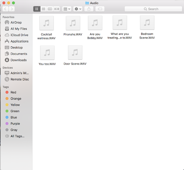
I detached the audio from the original clip and removed it from the film, and then added the field recorder audio which I had saved in a file called 'Audio' so it was easy to locate.


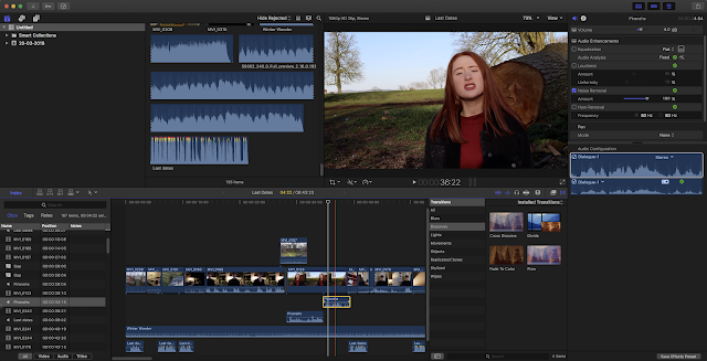
I had to adjust the audio a few times by cutting it short at the beginning, and moving it to fit the filmed clip perfectly. Once the audio fitted perfectly against the filmed clip, I noticed that the sound of wind was obvious towards the end of her speech, so to remove this sound as much as possible, I used the blade tool to split the audio into two parts from where the windy sounds began, and used audio effects on the audio affected by wind. I set the Equalisation to 'Flat' and checked the Audio Analysis which passed with no problems. So, I clicked to see more on the audio analysis, and from here I was able to adjust the effects myself, so I set Noise Removal to 100%. This helped to edit the sounds of wind out as much as possible, so it's quite subtle now. The subtle wind sound actually sounds natural though, as the clip was filmed outside, so this adds to the film. 

Friday 20 April 2018

Narration

20th April 2018

Today, we completed the narration for our film. The narration was spoken by our teacher, who watched the film as he read the script so that we could accurately time the narration to fit perfectly. To do this without noise interruption, we had to export the film to a MacBook which we could bring to another room so that we could have peace and quiet without the noise of classmates. This allowed us to have a much clearer audio.

I wasn't present for the recording of the narration as I was off school sick, but I received feedback from my team members about the narration process and I listened through to the recorded narration to ensure that it was perfect for our film. 

Thursday 19 April 2018

Magazine Review

Our group had the task of writing three different film reviews four our film. To do this well, we each analysed a bunch of film reviews from various websites. I decided to analyse the review for the film "Ghost Stories" from the Empire Magazine. In my analysis, I read through the entire review and jotted down the basic structure of the review, which would heavily assist me whilst writing my own. This would act as a basic guideline for writing the review, roughly taking a paragraph for each section.


I also added some social media links into the end of the review, to increase promotion of the film - which I discuss more in my evaluation.

My film review:

On the off chance that there are fans of films surrounding the topics of awkwardness, dating, murder and blood, well, this film may be the one for you. 'Last Dates' begins just like a dating show, consisting of our first serial killer, Bobby, played by Cormac (Dwyer), who butchers his victims, and our second, Poppy, played by Beth (Hamill), who has a slight taste for poisoning. Their awkward yet joyful date quickly takes a downward spiral into becoming a murderous crime scene. I guess the date was just so wonderful, that it was to die for.

Based on the British TV show 'First Dates', 'Last Dates' takes this concept, flips it around, adds a a couple deaths and voila, the film was born. Two cruel characters looking for love ending up on a deadly date with one another could never end well, who could've expected that two serial killers would end up killing, well, each other? There are tons of obvious ways that this story could go, however, the plot written by Shearer, McKegney and Hamill, takes very few of them. The film is howlingly funny with its ludicrously sarcastic humour throughout, which is a the complete opposite of what we would expect from two strange, yet lethal characters. 

Hilariously funny, the audience are practically in stitches throughout watching the characters attend their uneasy first date. However, this quickly changes from being side splittingly amusing to a tragic downfall. The interesting yet unexpected plot twist (although the murders were foreshadowed, how could we not see it coming?) draws the audience in and leaves them wanting more as they indulge into the bizarre lives of these murderous criminals. 

Shearer, McKegney and Hamill did a great job on this film, certainly reviving themselves from their not-so-successful film, "The Secret", which premiered last June. I think we can all agree that getting themselves back into producing comedic films was a life saver for their careers and the diminishing mockumentary genre. Make time to take yourself out and see this film - it'll truly take you out of the world of stress we all live in and let you indulge in the crazy lives of two serial killers. You'll be dying with laughter.


The final review:


Updated Choosing Music

Today, we inserted the track that we found for our final scene into the film. Eimir went searching for a track last night and found one on a website called Smart Sound. The track that we used was called 'Americana'. 


The track has a very sad and melodramatic vibe to it, making it perfect for the scene. After lots of searching, we couldn't find any tracks that had the creepy jazzy feeling to them that actually fit the scene, so we changed the idea to have more of a depressing/sad feel. 

The only issue with the track was that it had a man saying the words "Smart Sound" roughly every 15 seconds in the track, to trademark the track even though it's royalty free. Because of this, we had to blade the track in 4 different areas and split the sound so we could allow the music to match up again, without it being obvious that we cut parts of the track out. This took some time, but it was manageable as we used the fade in and fade out effect a lot to make this flow better.

Wednesday 18 April 2018

Making the Credits

Wednesday 18th April

Today, we created the credits for the film. Instead of placing opening credits like we did in our film last year, we decided to place rolling credits on the final shot of the poison bottle. We placed the rolling credits on the side of the shot which looks very dark, almost black, and coloured the credits in white and the font as Times New Roman, which stood out exceedingly well against the dark area of the shot. We decided on rolling credits as we felt that they look very simple and plain, which is what we wanted for the ending of the film because the ending has so much going on in it. 

In the credits, we named the actors/actresses we had and their roles in order of importance in the film. We then placed our own names and our generic roles in the production of the film, including production, editing, directing and casting. We also credited ourselves for coming up with the plot idea, and credited Eimir for mainly scripting the film. 

Once the final shot fades out, it fades to an ending title screen which displays text saying "Last Dates" once again, but this time, the text is a shade of red and in the font Sketch Block and the text appeared by itself on a black background this time. This text is in the size 168.0

Tuesday 17 April 2018

Making the Title Screen

Tuesday 17th April

Today, we created the title screen for our film. Firstly, we brainstormed ideas of what we wanted the title screen to include. This was easy enough as we all seemed to be on the same page due to the fact that we were focusing on a title screen for a dating show, so we already had pre-conceived ideas of what these title screens should look like from watching shows such as First Dates or The Undateables. We wanted to make a title screen really similar to these, pretty simple but effective - usually animated.


We noticed that Final Cut Pro didn't offer us the animated widgets that we wanted to use in our title screen, so we went searching for some animations that we could download for free. We came across a website called Stupid Raisins, which allowed you to download packs of animations for Final Cut Pro. We downloaded a pack called Sign Pop & Template Pop which contained a number of random widgets, but most importantly, it included a widget which looks like a folder which a heart on it - which perfectly fit our film. We decided to add this to a title screen with a white background. The title screen we chose had a black box image placed on it which we couldn't delete, so we placed the animated image on top of that. We also changed the text to say "Last Dates" and changed the font to Al Bayan and the size to 72.0. We also altered the colour of the font to a pink/peach shade, and changed the colour of the animated folder to be the same colour as the font, making it look more professional and nice to look at.

We then added some effects to make it a little more interesting, so we added the effect Bokeh Random which allowed the title screen to look as if it had some flashing lights flowing across it, but you could only see this effect on the text because the background was white, which left a nice effect. The animation also flew in on the title screen and flies out of the title screen, going to a black screen then transitioning to the next scene as the music ends. 

We're really happy with our title screen, and think it looks really professional, and as if it was made for a real dating show.


Friday 13 April 2018

Choosing Music

13th April 2018

Today we were researching music for the beginning and end of our film. We needed some light hearted and upbeat music generally consisting of instruments like a piano rather than acoustic guitar. We decided to search for this sort of music because it is very common in dating shows and documentaries, so we figured that it would perfectly fit our film as it is a mockumentary mimicking a dating show. 

We searched for snippets of this sort of music on a few websites that supplied royalty free music, as we're not able to use music that is copyrighted which made it much more difficult to search for music that will fit.

The websites we have used to search for music so far have been:
After searching through multiple categories of music types such as calm, upbeat, jazz etc. and listening to roughly over 60 snippets, we decided on a track called 'Winter Wonder' from Purple Planet. 

As for the music at the end of the film during the choking scene and the credits rolling, we have not yet found something that is royalty free and fits the scene how we want it to. Ideally, we're looking for something similar to Patsy Cline's "She's Got You", however it is very difficult to find a track like it with lyrics without it being copyrighted.


Tuesday 10 April 2018

Changing the Brightness on shots

10th April 2018

Today, I focused on editing the brightness and saturation of some of the shots in our film to make the shots match better with the shots on either side of them, and match the theme of the film better. This also allowed me to make shots more clear and easier on the eye of the audience. 

Below are a number of shots which I have edited the brightness/saturation of:


This shot needed lots of work to it because the lighting is so dark in the shot and also has a very warm hue, which we didn't really want because the shots on either side of it were more cool toned and lit very brightly. To alter this, I played around with the highlights and midtones to make it a little bit brighter, and I altered the saturation to make it a little less warm toned. All of the details are included in the screenshots:

BEFORE:


AFTER:


Below are a number of other shots which I have adjusted the brightness and saturation of, and the details of the brightness/saturation changes are included in the screenshots:


Friday 6 April 2018

Editing

Directly after filming was finished, we began editing the film. Even though we identified the faults in the footage from the first filming day and needed to refilm, we edited as much as we possibly could from the good footage. We firstly sorted through all of the footage and deleted all of the footage we definitely weren't using to ensure that we didn't get mixed up with shots. We then sorted through the script and shot list to see the order in which we would place our shots. This was fairly easy as we initially followed the planned shot list and then decided to play about with the order of some shots to see what parts fitted better and what transitioned well into each other.

Initially, we just wanted to get a grips of the general plan of the film, and get all of the shots into order and then we could deal with sound and brightness at a later stage. Once we had a general layout to the film, we started playing about with the audio of the shots and moving it around so that we could allow shots change whilst the audio still played. 

Once we had also gotten the footage from refilming, this was all much easier because we could complete our storyline and begin focusing on how to make the editing better. At the moment, we're currently trying to adjust the audios and adjust the brightness of the shots to make sure that the shots are flowing well and look good together. 

Tuesday 3 April 2018

Poster Research

In order to know what sort of poster to create for our film, I decided to do a little bit of research into what mockumentary/comedy posters look like so I could gain a general idea of the typical codes and conventions of the posters made. 

Image result for bruno

Image result for what we do in the shadows

Image result for the office usa

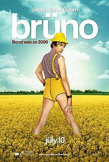
I then went on to analyse the poster for Borat, and applied the logic I gained from that to the other posters that I viewed, and I noticed that typically, the main characters of the film are placed in the centre of the poster, the reviews are at the top and bottom of the poster, and the font typically reflects the theme of the film.


Monday 2 April 2018

Re-Filming Day

Due to errors in the first filming day, we decided to meet up again and refilm the last few scenes including the dinner scene, the interview scene and the killing. We refilmed these shots on the 31st of March 2018. This filming session took around 2 and a half hours, which worked well because it was long enough to get the filming done again to a better standard and it also didn't take much time out of our actor's days. We filmed from 7pm to 9.30pm. 

Like the previous day, we decided to split the crew up into separate roles again to ensure we weren't wasting time, and we also followed the re-shooting schedule closely to make sure that we didn't miss any shots - and we also paid close attention to the accents of our actor/actress, making sure that they didn't change again. For one scene, I left Eimir and Maeve to film whilst I made the blood, and likewise Eimir left to set the interview scene up whilst Maeve and I filmed. This allowed us to be more flexible with our time. We also found that we had more time to focus on filming because we had less props to prepare, as we didn't need to refilm the choking scene - so we didn't have to make the pasta again, and we also didn't need to use the poison bottle again.